Outcome
InStride Health's old self-scheduling tool had a ~25% drop-off rate. Here's what changed.
"After we introduced the new screen, we had a near 100% scheduling rate. The main thing that changed was the UI. That delta resulted in a 3 to 5% increase in our enrollments — the biggest single impact."
The Problem
InStride Health is a virtual mental health program for children and teens. Enrollment depends on families scheduling a clinical evaluation — the highest-intent step in the funnel.
The existing scheduling system (Zoho Bookings) caused 1 in 4 families to drop-off at booking due to poor availability logic and a cluttered multi-field flow.
This directly impacted revenue, delayed access to care, and escalated to board-level visibility.
Brought in as the sole product designer to stabilize and redesign the scheduling experience, driving decision-making across product and engineering constraints.
"We aren't going to make our enrollment numbers for October. This is the highest priority problem we've got to solve — and there are a lot of eyes on this project." — Product Manager
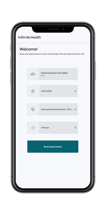
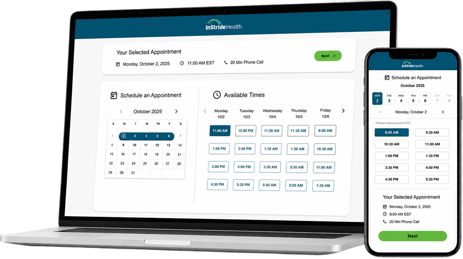
Everything on one screen — CE, date, time, timezone — all from raw drop-downs. No guidance, no trust signals. Slots could be lost at confirmation.
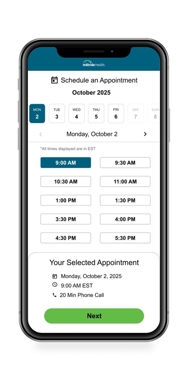
One decision at a time. Date, then time. Clean availability, summary, clear next step. Mobile-first for stressed parents on the go.
Research & Diagnosis
The assumption: fix the UI. The reality: the problem wasn't surface-level.
What I did: Ran moderated sessions with 8 families attempting scheduling, analyzed 3 months of booking logs to map where abandonment clustered, and interviewed the clinical team about real evaluator availability.
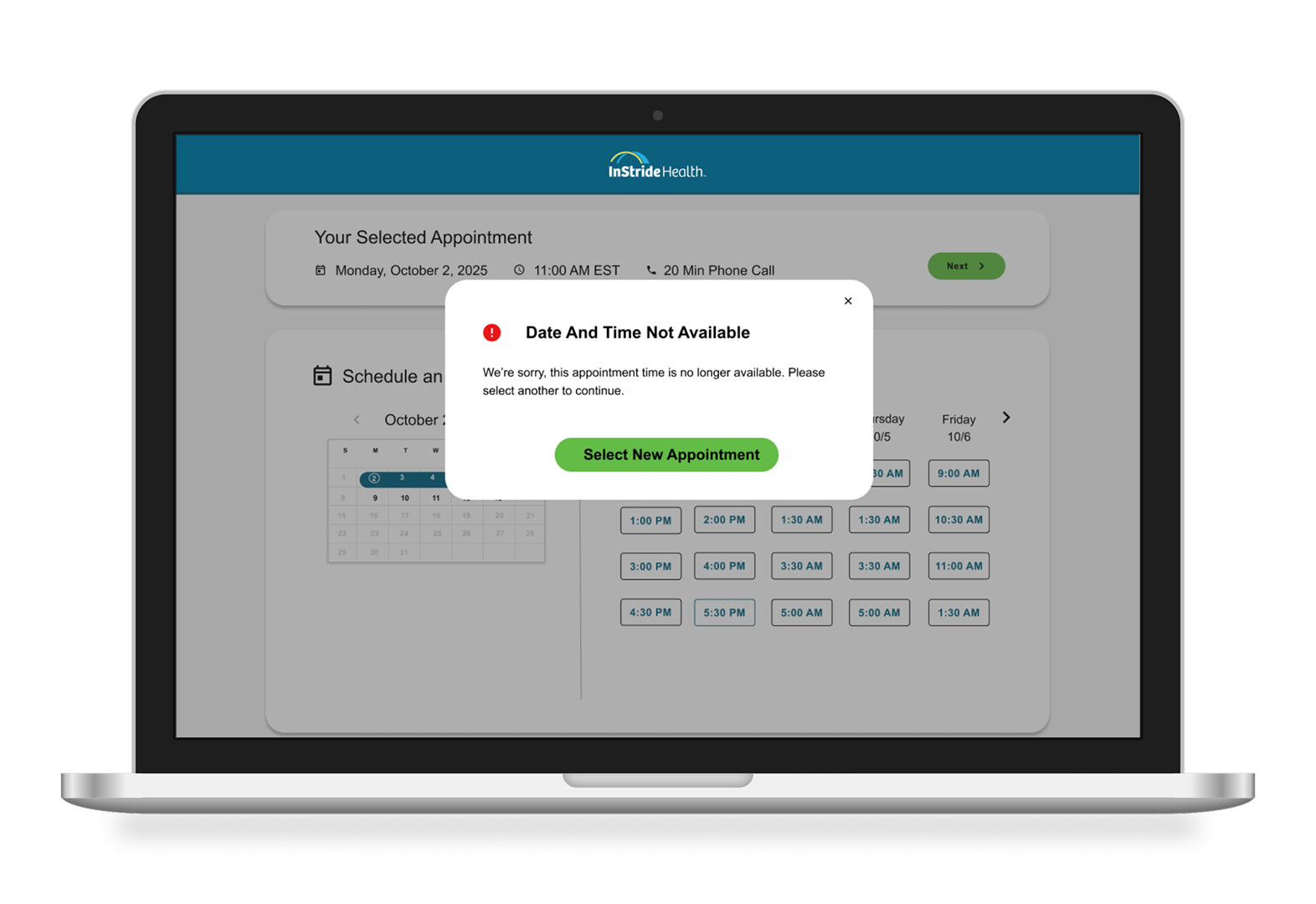
Families abandoned not at discovery, but at commitment — they'd select a time, then hit a confirmation page where the slot was already booked by another family. High trust loss.
The Zoho form showed evaluators with "flexible" availability that didn't actually exist — clinical reality was far more constrained than the system reflected.
Parents making this decision were under time pressure (kids struggling now, need help fast). Every additional field increased cognitive load at the worst moment.
The core problem wasn't "bad UI" — it was misalignment between what the system promised and what it could actually deliver. Fixing the surface wouldn't solve booking failures. I needed to align the backend first, then design accordingly.
Design Approach
I owned the end-to-end design — research through delivery — as the sole designer in a pod with one PM and four engineers. I extended InStride's design system and defined net-new patterns where none existed. The brief: ship fast without cutting corners on a product serving families already under stress.
Key Decisions
Solution
Rebuilt scheduling as a system-driven, mobile-first experience where availability and booking logic are aligned — so users can complete scheduling without friction or failure.
Only valid options shown — Pre-filtered by capacity, licensure, and real-time constraints
Single guided flow — One clear path, no re-entry or backtracking
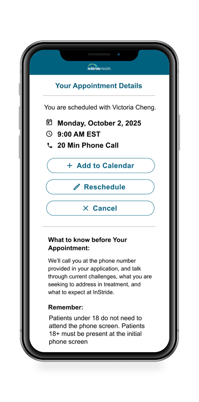
Immediate feedback — Selection and confirmation are always clear
Always bookable — What users see is guaranteed to work
Early iterations exposed gaps between availability logic and real evaluator constraints, forcing a pivot toward deeper system alignment before UI refinement.
Iteration: From Flexibility to Reliability
First approach: I tried showing "all available evaluators" with timezone handling, hoping flexible options would reduce friction. It didn't. Sessions showed families still second-guessed themselves because they didn't know if a slot would actually be there at confirmation.
Refined approach: Worked with engineering to pre-validate every slot shown to the user. No "maybe available" — only slots that were actually guaranteed. This meant fewer options on screen, but every option was real and trustworthy. Completion rates jumped immediately in testing.
The decision: constraint (fewer visible evaluators) beat flexibility (more options). Reliability at the moment of commitment mattered more than perceived choice.
Reflection
A more straightforward flow improved completion by reducing decision fatigue during an already stressful moment and reinforcing confidence at the point of commitment.
Aligning the UI to real operational constraints mattered more than increasing perceived flexibility.
The project reinforced that simplifying a system is often less about removing UI and more about reducing uncertainty.
What I'd Do Differently
In a two-week sprint with board visibility, I moved fast and made it work. But I'd have pushed harder upfront for deeper system mapping with engineering before iteration began. The race condition we caught late could have been prevented with a shared constraints doc at sprint start. This would've reduced the mid-sprint pivot and given us more time for polish and edge case testing. Speed and rigor don't have to conflict — it just requires alignment before exploration.