Patient  ·  Caregiver  ·  Provider Workflows

Designing for Care,
Not Just Compliance

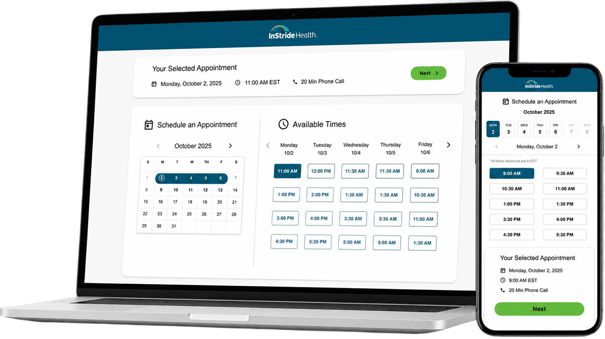
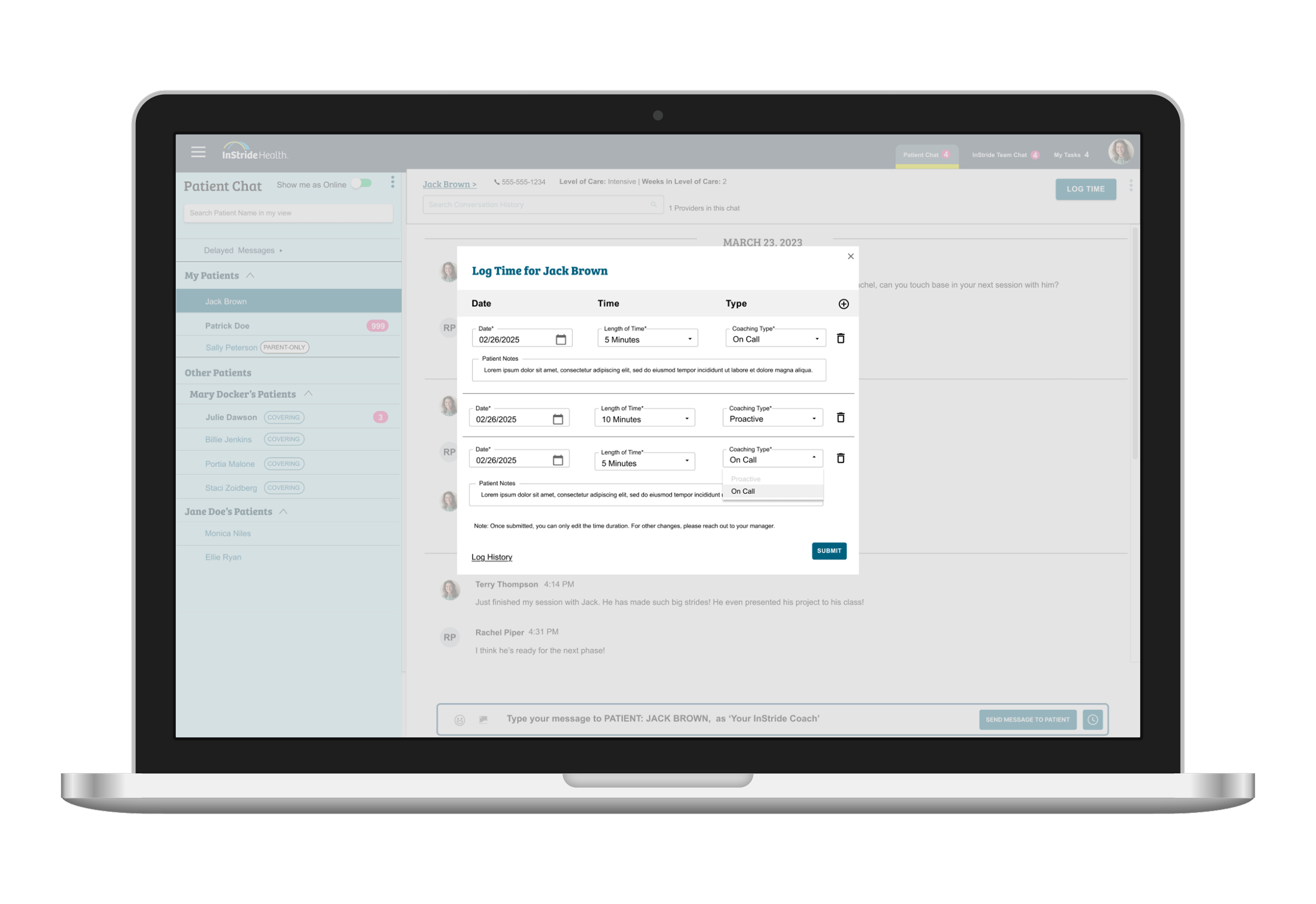
Redesigning a behavioral health app where patients, caregivers, and care teams were all looking at the same information — and drawing completely different conclusions from it.

Three people. One app. Three different realities.

Patients, caregivers, and providers were often looking at the same information—but drawing completely different conclusions from it. A missing assignment might look like procrastination to a caregiver, disengagement to a provider, and simply "I'll do it later" to a patient. The breakdown wasn't missing information. It was a lack of shared understanding.

Patient Caregiver App Hero
Role
Product Designer (Partnering with PM, Engineering, and another Product Designer)
Team
2 Designers · 1 PM · Engineering
Timeline
2 Sprints · 4 Weeks
Platform
Mobile App

The App Was Part of the Treatment — But It Wasn't Working

The app extended care beyond therapy sessions — supporting assignments, communication, and between-session reinforcement. Over time, it stopped feeling useful enough to return to.

The problem wasn't missing information. Patients, caregivers, and care teams were all seeing the same signals — and interpreting them differently.

Two years after launch, the app had quietly lost its place in users' routines. Some returned — but very few continued. The experience wasn't broken enough to abandon entirely, but it wasn't valuable enough to sustain.

The ask was simple: refresh the UI. Within days it was clear it wasn't.

As we began auditing the experience, it became clear the issue wasn't visual polish. Different users were relying on the same information for completely different decisions.

Login activity increased consistently after the May 2024 rollout and sustained across both user roles through April 2026 — the full period of my tenure. Coordinators noted a reduction in caregiver outreach to confirm appointment details. The coordination clarity we designed for showed up in the data.


Halfway through the sprint, conversations kept circling without landing. Three of us in a sync — all raising valid issues, none of them wrong. We weren't disagreeing on design.

"We were each designing for a different user — and none of us had said it out loud."

Once the three roles were explicit, the circling stopped. We hit pause, stepped back, mapped who we were actually designing for. We looked at usage data — which roles were actually returning, where they were dropping off — and suddenly the three needs became unavoidable.

This Wasn't One Experience — It Was Three

Three distinct roles shared the same system — but experienced it in fundamentally different ways, often without visibility into each other. Early on, we mapped nearly ten distinct user types — patients by age group, caregivers by household structure, divorced parents, multi-patient families. We couldn't design for all of them. Narrowing to three was itself a design decision.

"Clarity broke down where responsibility was shared — and the system didn't make ownership or progress visible."

Shared Care System
3 Core Problems
Each interpreted differently by each role
Assignments
Engagement Status
Visibility
Assignments
Engagement
Visibility
T
Patient (Teen)
Execution
"What do I need to do right now?"
Immediate tasks
Progress
Low cognitive load
Pr
Provider (Out of Scope)
Evaluation
"Is the patient engaged — or did they just not see it?"
Did patients do their assignments?
Disengagement vs. invisibility
C
Caregiver
Interpretation
"How do I coordinate and support care?"
Visibility + coordination
Attribution clarity
Multiple schedules
Same data. Different conclusions.
Patient saw
"Not done yet — I'll get to it later."
Provider saw
"This patient is disengaged from treatment."
Caregiver saw
"My child isn't doing the work. Something is wrong."
💡

The breakdown wasn't in any single screen — it happened in the gaps between roles, where the system relied on interpretation instead of clarity.

No Shared Source of Truth

No agreed-upon definition of "completed" or "engaged" existed across teams. Terminology was scattered: assignments were called "Goals," "Tasks," "Exposures," "Homework," and "Practice" interchangeably. Aligning on language wasn't a precondition to the work — it became part of it.


How We Scoped The Work

Narrow to 3 roles

Early mapping surfaced nearly ten distinct user types — patients by age, caregivers by household structure, multi-patient families. We could've designed flows for all of them. Instead, we narrowed to three because meaningful improvements for the majority beat shallow improvements for everyone, and focus was non-negotiable in a two-sprint window.

Scope out provider experience

Designing for providers would have required broader clinical workflow decisions outside the scope of this initiative. Rather than design against assumptions, we intentionally focused on patient and caregiver experiences first. This decision kept the work grounded in real constraints instead of speculative features.

Patient: visual refresh only

The patient homepage already did what teenagers needed — assignments and visits visible on load. We could've redesigned it to feel fresher, more modern. Instead, we refreshed only the visuals, renamed "To-Do" to "Assignments" (a word the clinical team already used), and directed engineering capacity toward caregiver coordination, where the actual problem was. The patient experience wasn't broken — clarity was.

Building Understanding Without Direct User Access

Direct interviews weren't possible — so we built understanding through behavioral signals, clinician feedback, and an informal conversation with a caregiver who worked at InStride and was open to speaking directly.

01
The first question was: who was the app actually serving?
I pulled assignment activity by age from Mixpanel mid-discussion to validate who the app was actually serving. Teenagers were the majority. That single data pull shifted the redesign in one working session.
02
Clinicians surfaced what usage data couldn't.
Coaches and therapists surfaced recurring friction patients described during care sessions — our closest proxy to direct patient voice.
03
Missing assignments created different conclusions across roles.
Caregivers saw disengagement. Patients saw delay. This misalignment was costing retention — and it meant any design solution had to make assignment visibility unmissable, not just better.
04
Consumer apps revealed the patterns users already trusted.
Existing scheduling patterns made upcoming responsibilities easier to scan and act on — without requiring users to reconstruct context.
05
One caregiver conversation changed the direction of the calendar redesign.

A live caregiver review session became our closest proxy to direct usability testing:

  • The dense grid forced her to do interpretation work — figuring out what belonged to which child, when
  • She needed to know "what's happening with my child right now," not manage a calendar
  • A simple agenda view (date + assignment + child) answered that directly

Caregivers Needed Coordination Visibility — Not Calendar Management

Caregivers weren't managing a schedule. They were coordinating care across appointments, assignments, and multiple children. Before they could take action, they first needed to understand who information belonged to.

Making Ownership Visible at a Glance

Before caregivers could coordinate care, they first needed to understand who information belonged to.

👥

This experience was designed specifically for caregivers coordinating care across multiple children enrolled in the program.

⚠️Before — Previous Caregiver Homepage Experience Expand
Before — dense weekly calendar grid
  • Weekly grid optimized for date navigation, not caregiving
  • Caregivers reconstructed care context mentally — nothing surfaced it automatically
Expand After — Redesigned Caregiver Homepage Experience
After — agenda view showing care at a glance
  • Chronological grouping externalized coordination work caregivers were doing mentally
  • Empty days removed — only days with care activity were shown

"On this day you have three appointments, on this day you have one. And if you don't have anything on the day, you don't show the day. That to me is the most usable."

— Caregiver, live design review session

What the Data Showed After Rollout

The redesign launched in May 2024. Login activity increased consistently across both user roles and sustained through April 2026 — two years post-launch, with no plateau. A modest summer dip recovered fully in the fall. Coordinators noted a reduction in caregiver outreach to confirm appointment details.

We tracked this through Mixpanel, the clearest behavioral signal we had for whether the app had become more useful in daily life. Login activity is a proxy metric, not a clinical outcome — but sustained engagement is a prerequisite for any therapeutic benefit the app was meant to support.

Expand POST-LAUNCH SIGNALS · MIXPANEL DATA Login Activity by User Role — March 2024 to April 2026 Monthly logins · Rollout began May 2024 · Data reflects full tenure through April 2026 UserRole.caregiver UserRole.patient (not set) 0 2K 4K 6K April July October January April July October January April May 2024 BEFORE ROLLOUT AFTER ROLLOUT Teenagers were the majority patient population Caregiver engagement differed from patients Behavior diverged by role across the same system Engagement continued increasing Sustained across both user roles Engagement remained active across both roles Expand
📊
Reading the Data

Login activity increased consistently following the May 2024 rollout and sustained across a two-year window — with a modest summer dip that recovered fully in the fall. The trend continued upward through April 2026, the full period of my tenure at InStride Health.


The Most Important Decision Was What Not to Change

We explored navigation models, new layouts, and age-flexible structures. It quickly became clear that approach would produce a compromise serving no one well. The existing patient homepage already surfaced the two things teenagers needed most: assignments and appointments. The problem wasn't on the patient side—it was caregiver coordination.

Explored Shipped
New navigation models Existing structure retained
Age-flexible layouts Teen-focused hierarchy
Homepage redesign Visual refresh only
Broader scope Caregiver attribution

Focusing on teenagers meant caregiver workflows would remain partially fragmented in this release. We accepted that tradeoff so engineering effort could be concentrated where coordination was breaking down most.

Patient Homepage Before and After Experience
Expand⚠️Previous Patient Experience
Patient homepage before
  • Bright color blocks with no key — visual noise without meaning
  • "To-Do" nav label was ambiguous for a teenage audience
ExpandExpand Redesigned Patient Experience
Patient homepage after
  • Assignments immediately visible on load — no extra navigation
  • Nav relabeled "To-Do" → "Assignments" for clinical clarity
Patient Homepage · Explored but Not Shipped · Supporting context
Expand🔍 Designed · Not Shipped
Patient homepage explored not shipped
  • Cleaner structure, new information hierarchy explored
  • Ultimately deprioritized — existing design already met the core need

Fixing the Experience Where It Was Actually Breaking

Caregivers managing multiple enrolled children had no way to distinguish whose appointment or assignment was whose. Everything was generic. No patient attribution. No visual anchor.

Key Design Decisions — Caregiver View

Patient-attributed appointments: Color-coded avatars with the child's initials on every session card — answering "whose appointment is this?" without an extra tap.

Persistent identity strip: A "Caregiver For" label anchors every item to the right patient. Always visible, never lost.

Inline due dates: Surfaced directly on goal cards. Caregivers had flagged being caught off guard by upcoming deadlines.

Color — intentional, not decorative: Color served two purposes: provider type (purple = coaching, orange = therapy, green = psychiatry) and patient attribution for caregivers with multiple enrolled children. We simplified — keeping color where it added navigational value, removing it where it added noise.

Tension: Clinical Accuracy vs. User Experience

Midway through the redesign, clinical stakeholders pushed back. The designs felt too clinical — closer to an EHR than a product for families supporting adolescents. We kept every attribution element (they solved the real problem). We just softened the tone — less density, more breathing room, language that felt supportive instead of diagnostic.

Caregiver Homepage Before and After Experience
Expand⚠️Before — Calendar Management
Caregiver homepage before
  • Individual visits and goals show no attribution — caregivers can't tell which child each item belongs to
  • Caregivers must open every item individually to understand context
ExpandExpand After — Care at a Glance
Caregiver homepage after
  • Color-coded avatars anchor every appointment to the right child
  • Persistent "Caregiver For" strip and inline due dates — at-a-glance clarity

"We've lost a bit of it feeling like a product for children and families."

— Clinical Stakeholder

Design was moving toward clarity. Stakeholders were reacting to tone. Engineering was already building. I worked with the team to separate signal from preference — absorbing feedback on tone and visual weight, holding the line on structural decisions that improved shared understanding. The caregiver redesign shipped as planned.

"We don't always have to take all the feedback we get." — PM


Two Designers, One Sprint, One Cohesive Product

I led the redesign strategy across the patient and caregiver experience — defining role-based workflows, restructuring information hierarchy, and shaping the shipped mobile experience in close collaboration with product, engineering, and another designer across supporting surfaces. We worked asynchronously but synced constantly — bouncing patterns between surfaces, resolving drift as it appeared, and iterating together so the work felt like one product when it came together.

Midway through, we sat down with both flows side-by-side. That's when we saw it: color usage had drifted in ways invisible in isolation. We mapped what should travel consistently (patient attribution, state visibility) and where they should differ (calendar vs. agenda). That became our systems foundation.

Surface Ownership · Sprint Structure
Product Designer
Care Coordination Surface
Scheduling & appointments
Agenda vs. grid decision
Patient attribution on cards
Calendar sync strategy
Cross-Surface Validation
Reviewed together before handoff
Design Partner
Treatment Progress Surface
Assignment flows & goals
Task visibility & state
Completion tracking
Provider interaction patterns
Holistic Pre-Handoff Review
Pulled all surfaces together before handoff — surfaced a color conflict only visible when both were seen side by side. The PM noted the team had never done this before.
Now standard

Building the Foundation Before It Existed

We didn't have a design system. What we built was more foundational: the practice a design system is made from — making state, responsibility, and progress explicit for everyone touching the same underlying data.

State Visibility

Defined what "assigned," "in progress," and "completed" should look like across the experience.

Not a precondition to the work. Part of it.

Role Clarity

Each role needed to understand who was responsible for what — ambiguity created gaps between what was assigned, seen, and understood.

Ownership had to be visible, not assumed.

Intentional Branching

Not every inconsistency was a mistake. Calendar cards and assignment cards serve different purposes and should look different.

We documented deliberate differences so future designers would know.

Reusable Components

Appointment card patterns built for the homepage extended directly into the calendar redesign — without additional engineering lift.

Reuse happened immediately. The next sprint was faster.

Systems Leverage · Sprint to Sprint
Sprint 1 — Designed
Shared Appointment Pattern
Built for shared appointment visibility.
Patient attribution, timing, provider type.
scaled into
Sprint 2 — Reused
Multi-Patient Coordination View
Same pattern reused. No additional engineering lift.
accelerated
Outcome
Calendar Sprint Launched
Same patterns. No rework. Faster execution because the foundation was already built.

Engineering reviewed the system decisions early and built the patterns once. Reuse happened immediately because the foundation was intentional, not accidental. Systems thinking only scales when engineering is part of defining it.

From Interpretation to Confident Action

The redesign changed how each role understood and acted on the same information. The goal wasn't aesthetic improvement — it was making assignment state, ownership, and progress visible and consistent across everyone who touched the same system.

The system no longer required interpretation — it enabled confident, aligned action across roles.

Patients
Assignments visible on load — no extra navigation
Caregivers
Progress distinguishable at a glance — no follow-up needed
Providers
Disengagement vs. invisibility now distinguishable
Early Signals
  • Following the May 2024 rollout, login activity increased across both patient and caregiver experiences and remained elevated through April 2026.
  • Care coordinators reported spending less time helping families locate appointments and assignment information — a directional signal that visibility improved.
  • While we couldn't directly measure care outcomes, behavioral signals suggested the redesign improved visibility, coordination, and day-to-day engagement with the platform.

What This Project Changed About How I Design

On Navigating Ambiguity

Creating shared language was part of the design work — not a precondition to it.

On Data Over Opinion

One demographic pull resolved weeks of debate. When instincts compete, data is a gift.

On the Discipline of Not Shipping

Knowing when your work shouldn't go out is harder than shipping — and often more valuable.

On Systems Before Systems Exist

Consistency became a shared deliverable — not a final polish step.

What I'd Do Differently

The caregiver conversation happened mid-to-late sprint — after we'd already identified the core issues and made a lot of assumptions. At the time, that sequencing made sense. We needed to understand the problem before we knew what to validate. But knowing what I know now, looping in a caregiver earlier would have shortened the circling and grounded some of those assumptions faster.

The provider experience remains an open loop. We scoped it out deliberately — the organizational strategy decisions hadn't been made — but that boundary also limited how far shared interpretation could improve. A follow-up sprint focused on the provider experience would close the coordination story more completely.

Every decision in this case study came back to one question: does this make the shared experience clearer, or harder to navigate?

"In a system where care is shared, clarity isn't just a usability improvement — it's what enables coordination to work at all."

OTHER SELECTED WORKS

Where the thinking becomes the product.

Case studies across patient experience, provider tooling, and operational systems — where design decisions carry real weight.